


Responsive Mobile Web Design
 Responsive web design (RWD) is a web design approach aimed at crafting sites to provide an optimal viewing experience—easy reading and navigation with a minimum of resizing, panning, and scrolling—across a wide range of devices (from desktop computer monitors to mobile phones).
Responsive Web Design, a term only recently coined in 2010, means that no matter what device you are using, smartphone, tablet, or desktop, the image adjusts according to the screen size of the device it’s being viewed on. Your clients need and expect full functionality on their mobile device just as they would get on a desktop. Responsive web design allows for that and enables easy reading and navigating.
Mashable called 2013 the Year of Responsive Web Design because as more and more consumers use mobile devices to access the internet, a mobile website is no longer a novelty but a must-have!
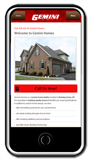
Gemini Homes Mobile WebSite Design
A simple three page mobile site that emphasizes contact information and gives a brief slide show of some of Gemini's work and building practices. PHP scripting allows automatic detection of most mobile devices and a link to the main site is on every page (suggested protocol).
In addition, the mobile site interacts with the MySQL Database and Content Management System of the main site, so that changes can be made to the main web presence and the mobile site at the same time.
Visit Website (Best Viewed on a Mobile Device)
What HC Designs Did
- Responsive Mobile Web Design
- PHP Scripting
- MySQL Database
A recent study found that 83% of people that land on a non-mobile ready site on their mobile phone will leave the site immediately!
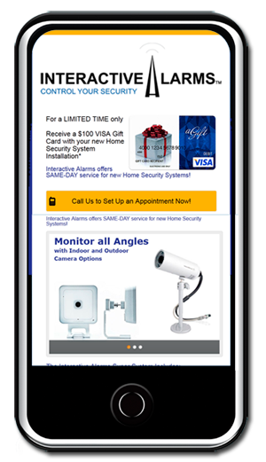
Interactive Alarms Mobile WebSite Design
Interactive Alarms opted for a 1 page mobile website that emphasized their product offerings and a strong call to action. The page was kept simple and used similar to other landing pages, in that the main object of the site was to motivate customers to call.
Visit Website (Best Viewed on a Mobile Device)
What HC Designs Did
- Responsive Web Design
- PHP Scripting to detect mobile devices
According to eMarketer, 65% of users ages 18-24 consulted the information they found about brands on social networks when making a purchasing decision, and a whopping 2/3 of consumers use search engines when researching a purchasing decision
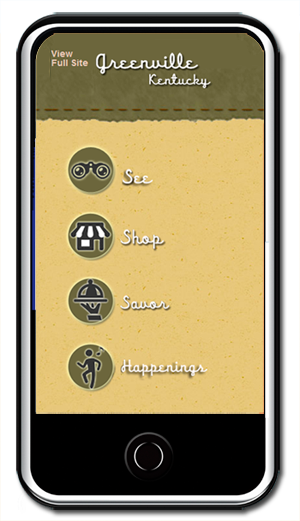
Greenville Tourism Commission Mobile WebSite Design
Greenville Tourism Commission needed a mobile site that highlighted tourism information for travelers on the go. The mobile design employed a simple routing tool that lined up with the main website's - "See", "Shop", "Savor", "Happenings" verbiage. The mobile site design used the existing CMS (Content Management System) to allow GTC's employees to easily update the site with new listings.
Visit Website (Best Viewed on a Mobile Device)
What HC Designs Did
- Responsive Web Design
- PHP Scripting to detect mobile devices
- MySQL powered Content Management System
91% of people in the U.S. have their mobile device within reach all day, every day.
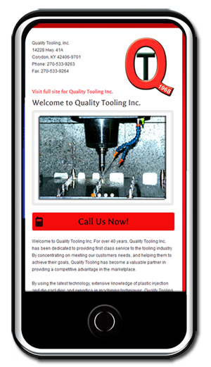
Quality Tooling Mobile WebSite Design
Quality Tooling Inc. understood the importance of implementing a mobile website with their existing website revamp project. A simple one page design used a rotating photo slide show, and basic contact information as the main features for this mobile presence.
Visit Website (Best Viewed on a Mobile Device)
What HC Designs Did
- Responsive Web Design
- PHP Scripting to detect mobile devices
70% of mobile searches result in action within 1 hour (Source: Mobile Marketing Association).